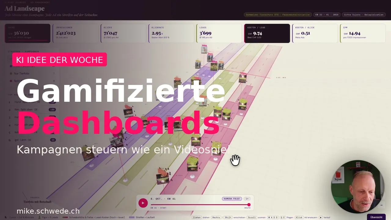
AI Idea of the Week: Gamified Dashboards – Run campaigns like a video game
Dashboards are either too simple or too complex. The gaming industry solved this decades ago. AI and MCP connectors now let us build business interfaces that are easy to understand – and let you take action instantly.
Logistics, operations, marketing – complex processes run everywhere, and key performance indicators (KPIs) are abundant. Yet, existing dashboards are either too simple to be useful, or far too complex. They never truly satisfy.
What gaming does better
Meanwhile, the gaming industry solved this challenge decades ago. Games like GTA or The Sims manage incredibly complex underlying systems and metrics. Yet, they remain intuitive, quick to learn, and accessible to everyone.
Why not learn from them?
AI + MCP: controllable interfaces
Today, AI makes building such interfaces relatively simple. Using connectors, Model Context Protocols (MCPs) and APIs, you can both visualise and control operations. We already run Meta campaigns via Claude rather than the native ad manager. Currently, however, this remains heavily text-based.
So, we took the next step.
Demo: The Campaign Garden
Our interface represents Meta campaigns as streets. Different ads run along these streets over varying durations. The height of a character represents ad spend. The number of characters shows leads generated. The pointers indicate clicks.
You can play the campaign from the start to see how it developed, or jump straight to today and explore the Campaign Garden.
The insights are instant. One ad costs 40 francs per lead – far too expensive, pause it. Right next to it is a top performer – highly promising, increase budget, extend duration.
All controlled directly from the same interface.
Applications for other industries
This principle goes far beyond advertising. You can apply this approach wherever complex processes meet KPIs.
ERP and manufacturing: Production lines as streets, machines as figures. Load and disruptions are instantly visible. You see who is waiting, who is running, and where the bottleneck is at a glance – without scrolling through spreadsheets.
Logistics and dispatch: Routes, deliveries, and vehicles as moving elements on a map. Delays turn red, smooth routes turn green. Intervene directly within the interface.
Sales and lead pipelines: Deals as figures moving through the funnel. The closer to closing, the further ahead. Stalled deals stand out immediately and can be addressed directly.
Construction: Multiple projects running in parallel, each with its own timeline, budget, and progress. Which is on track, which is in trouble, and where does management need to step in today?
Hospitality and hotel management: Tables, rooms, and reservations as a visual system. High-occupancy areas are instantly recognisable, and upselling opportunities can be actioned directly.
The common thread: the data was always there. What was missing was an interface people actually want to use.
Only the beginning
This is a proof of concept. But the core question is real: what must a dashboard do to make you actually enjoy looking at it – and know exactly what action to take?
What would you visualise in your business?